PowerApps Portals Dark Mode
Below are the steps to implement the Dark Mode POC I have put in place this week.
1 - Upload the following css file to your custom css list.

2 - Enable Based Theme in Portal Studio. Any theme works, but the “Dark Yellow“, as this is the them I’ve used as the Dark theme.
2 - Add the following html “code” to the Mobile Header content snippet.
<a href="~/">Dark Mode</a>

<div class="btn-group" id="status" data-toggle="buttons">
  <label class="btn btn-default btn-on-1 btn-sm ">
    <input type="radio" value="1" name="darkmodeselector">ON</label>
  <label class="btn btn-default btn-off-1 btn-sm active">
    <input type="radio" value="0" name="darkmodeselector" checked="checked">OFF</label>
</div>

<style>
  .btn-default.btn-on-1.active {
    background-color: #DA4F49;
    color: white;
  }
  .btn-default.btn-off-1.active {
    background-color: #006FFC;
    color: white;
  }
</style>
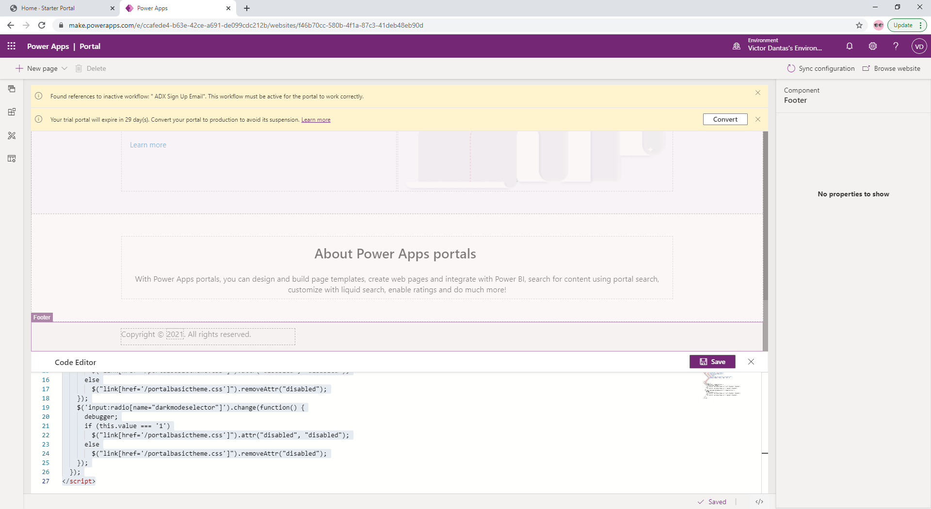
3 - Add the following code snippet to the Footer template through Portal Studio. (Scroll down to the bottom of the page, then click Footer, and open the Code area).
<script>
  $(function() {
    $('input:radio[name="darkmodeselector"]').change(function() {
      debugger;
      if (this.value === '1')
        $("link[href='/portalbasictheme.css']").attr("disabled", "disabled");
      else
        $("link[href='/portalbasictheme.css']").removeAttr("disabled");
    });
  });
</script>